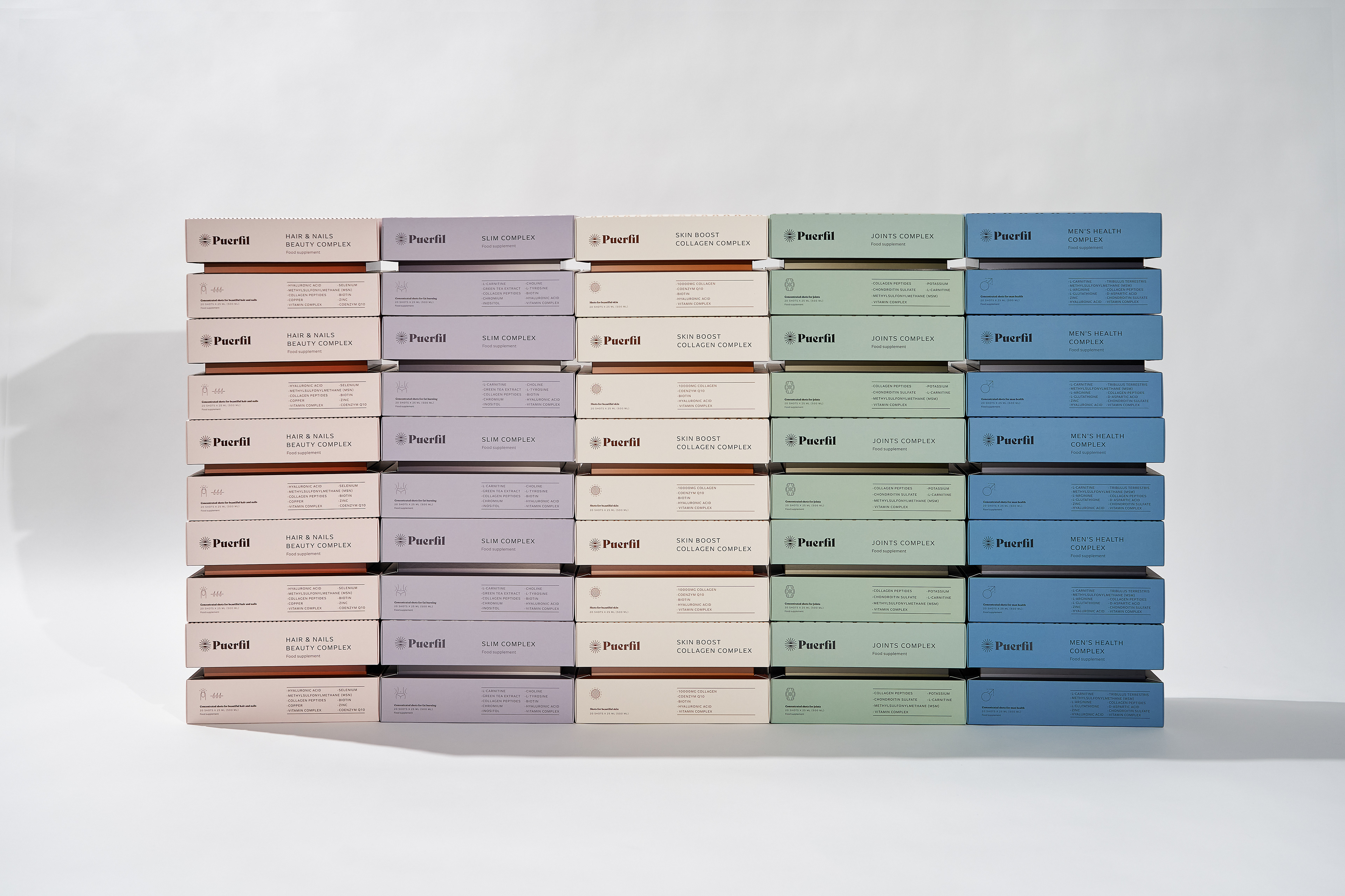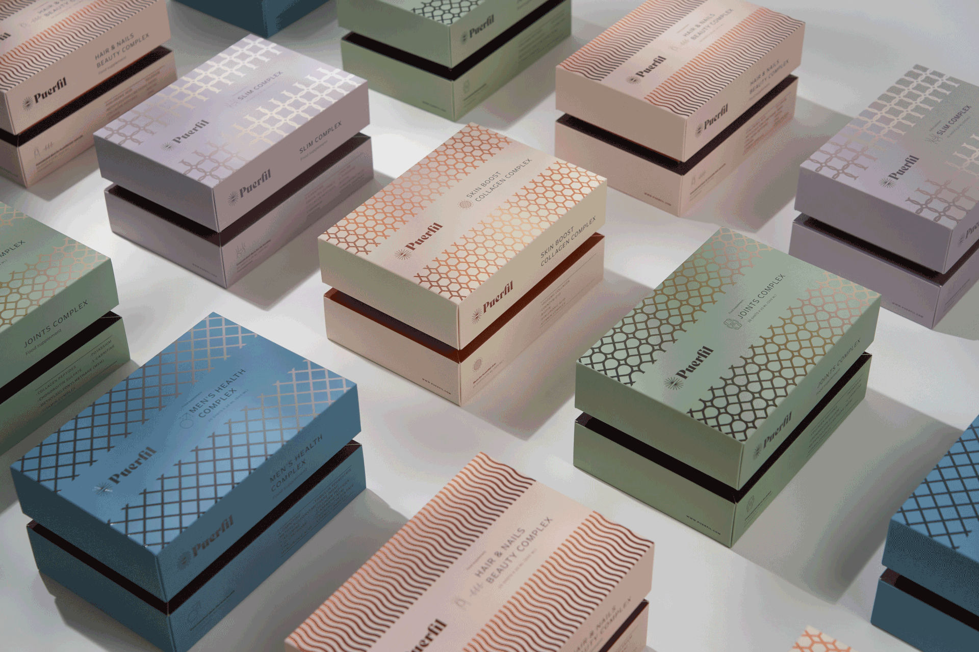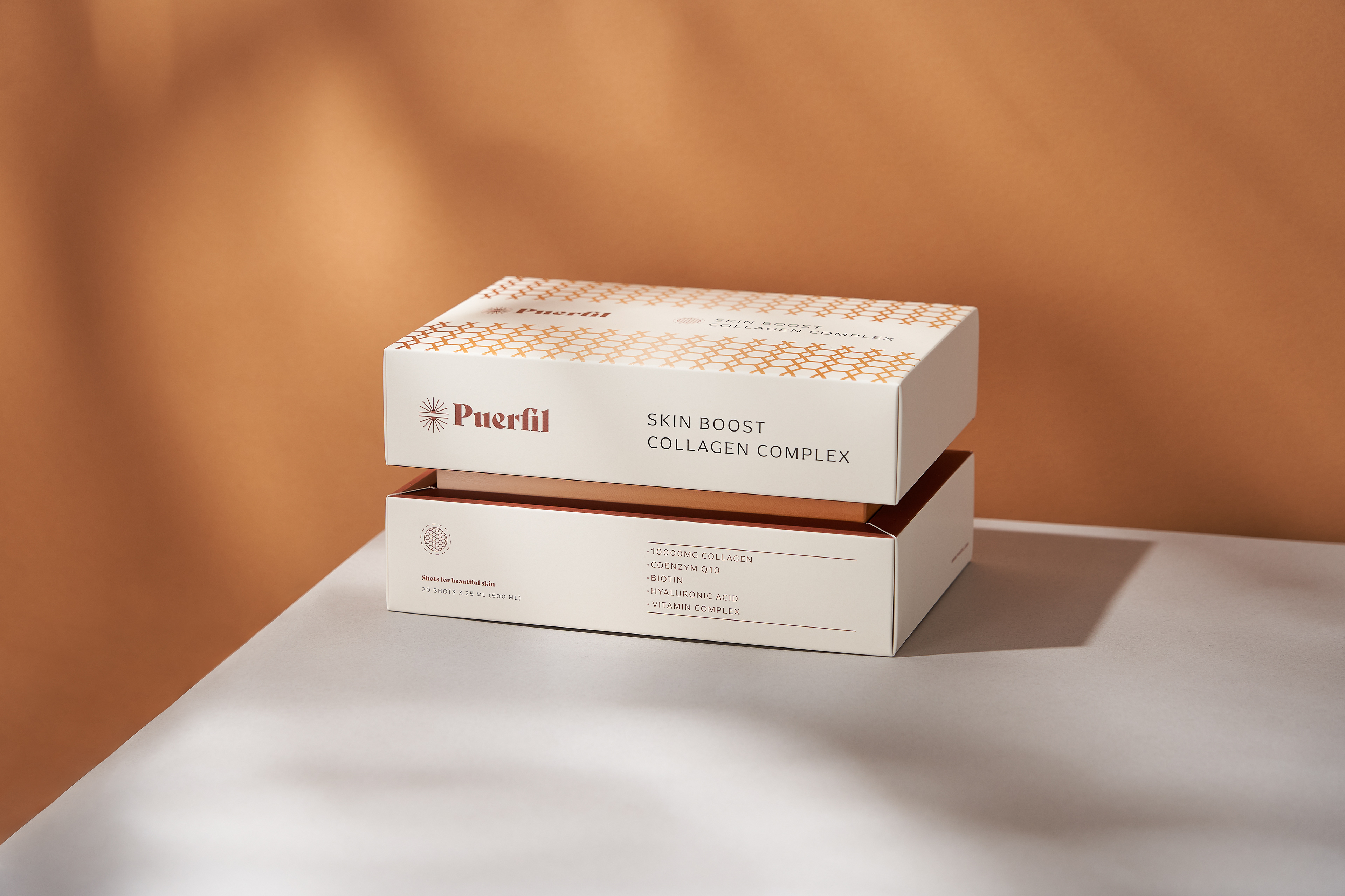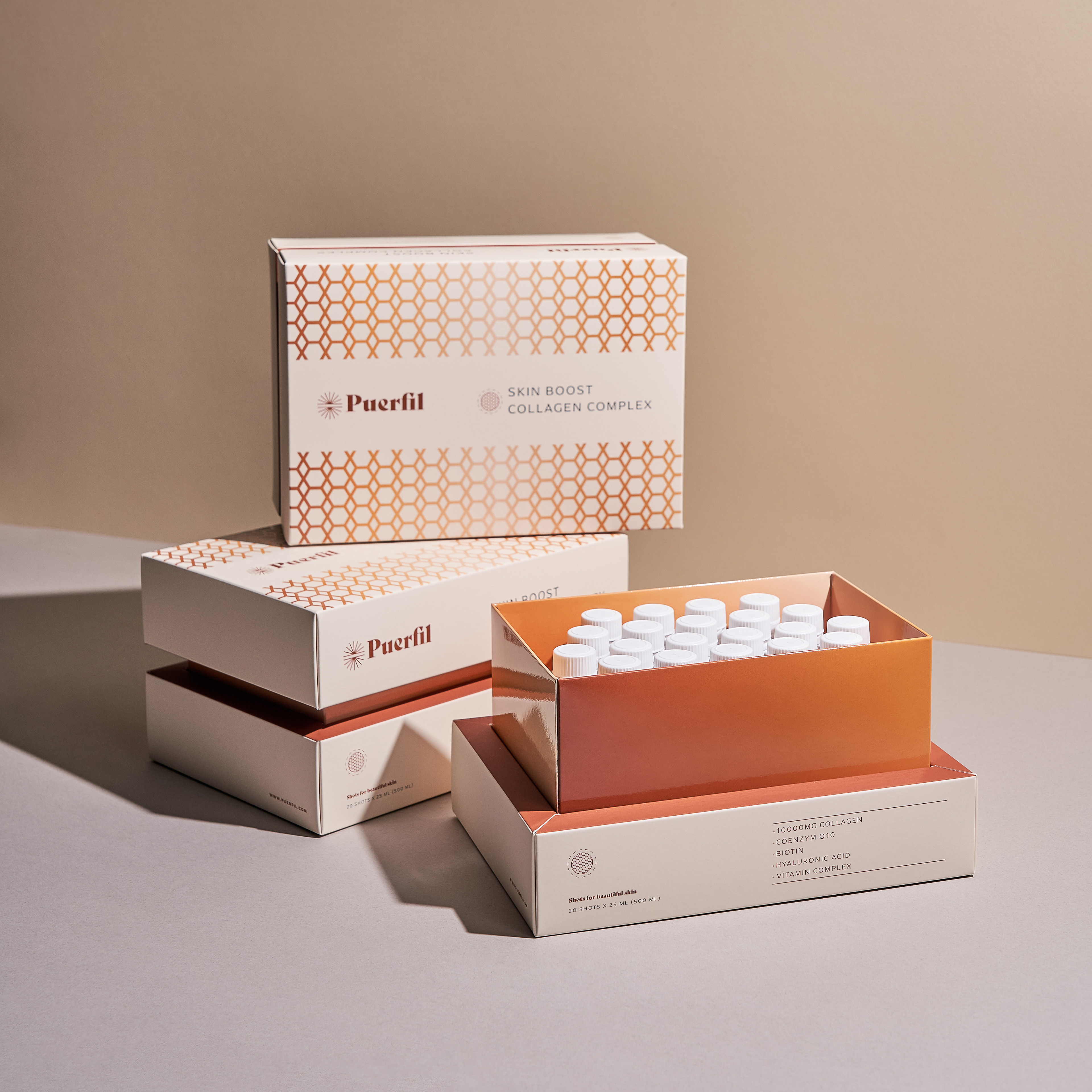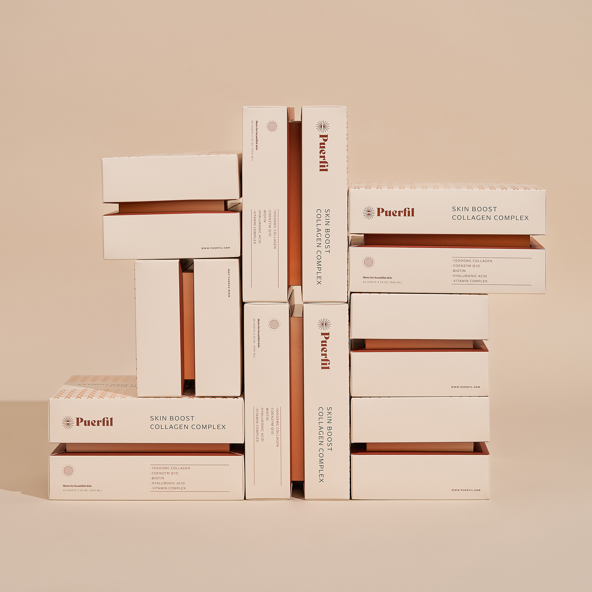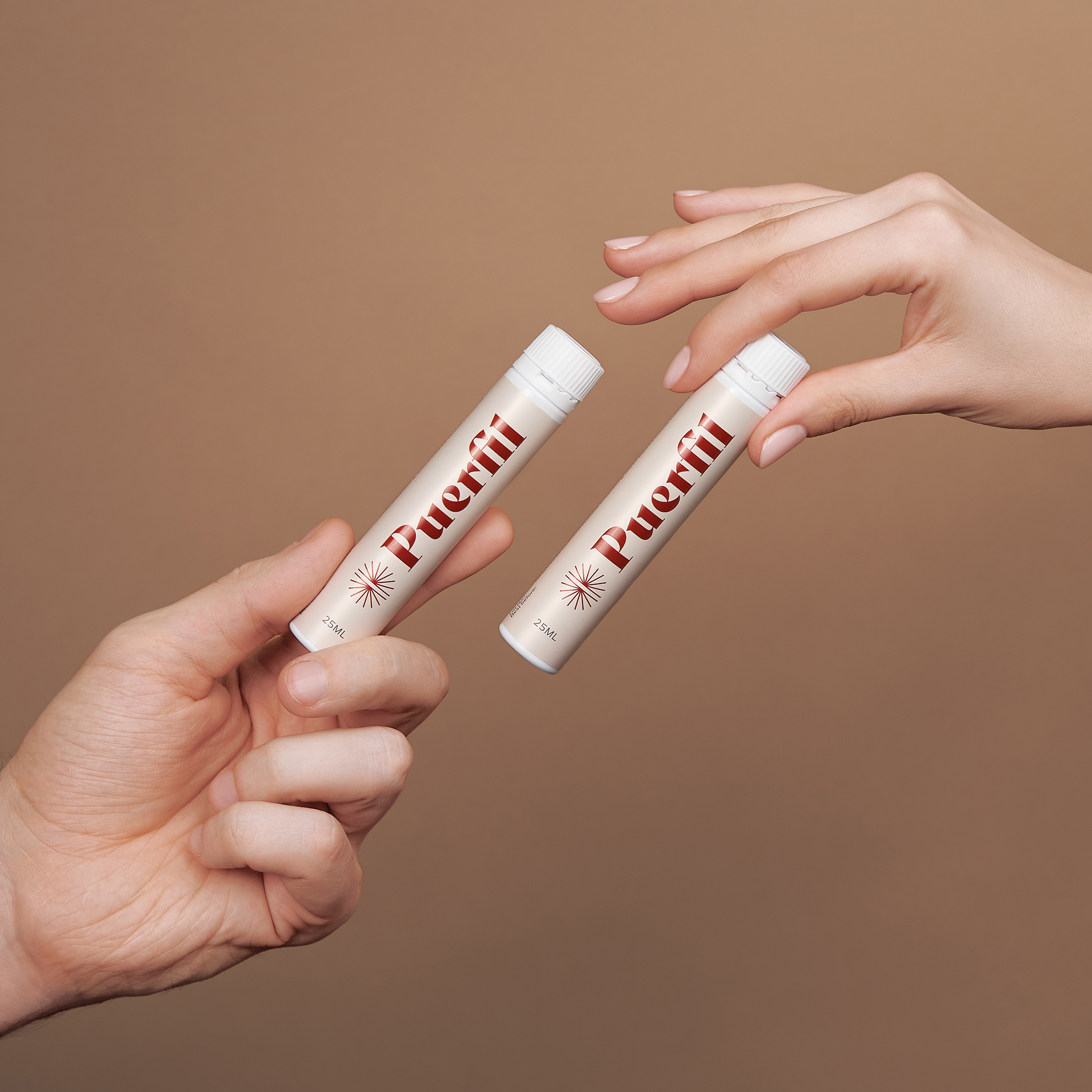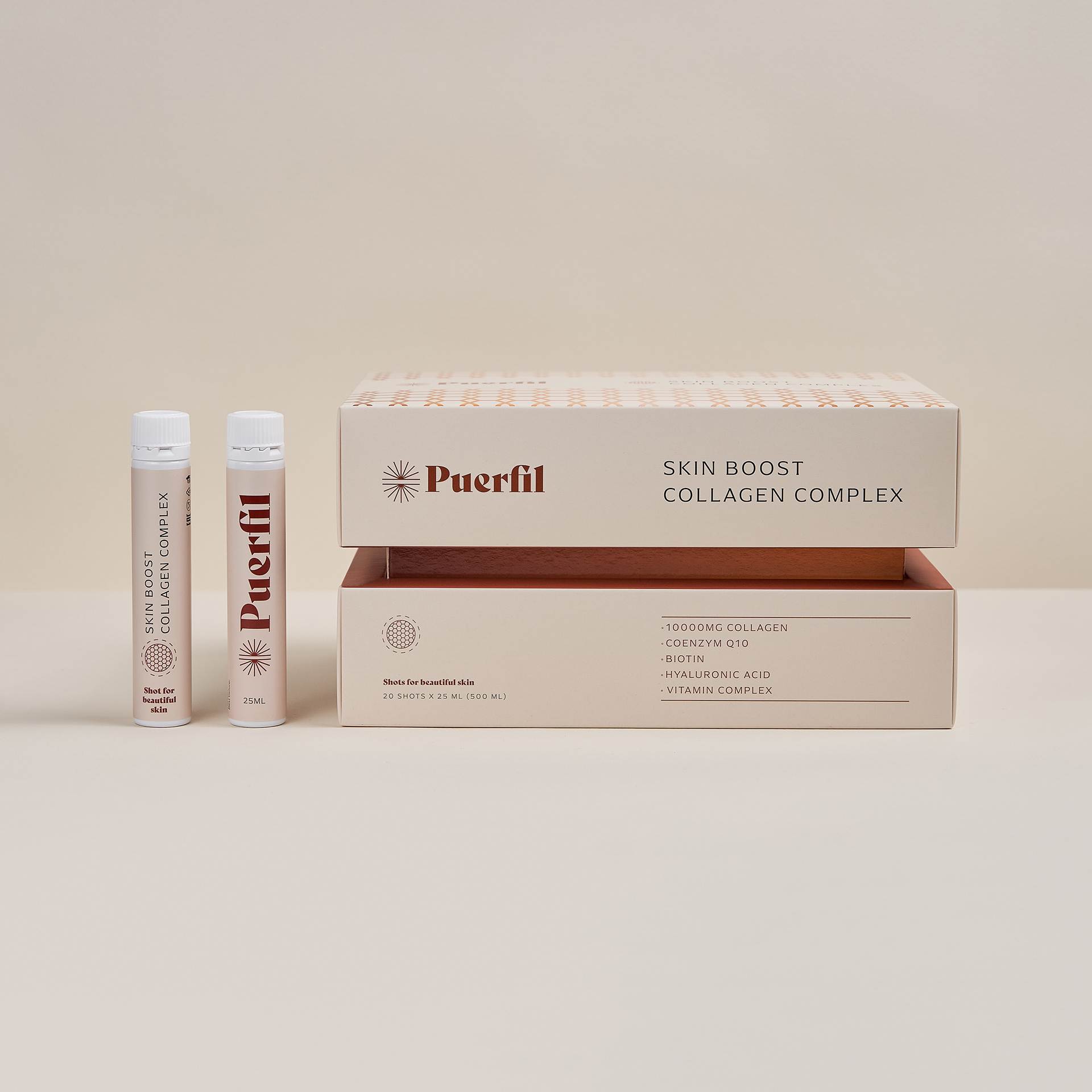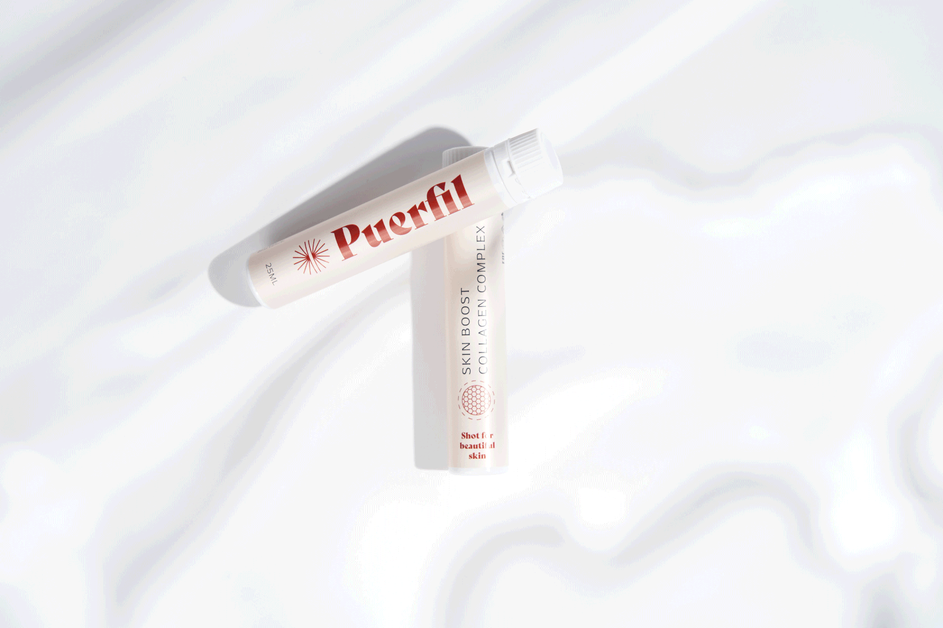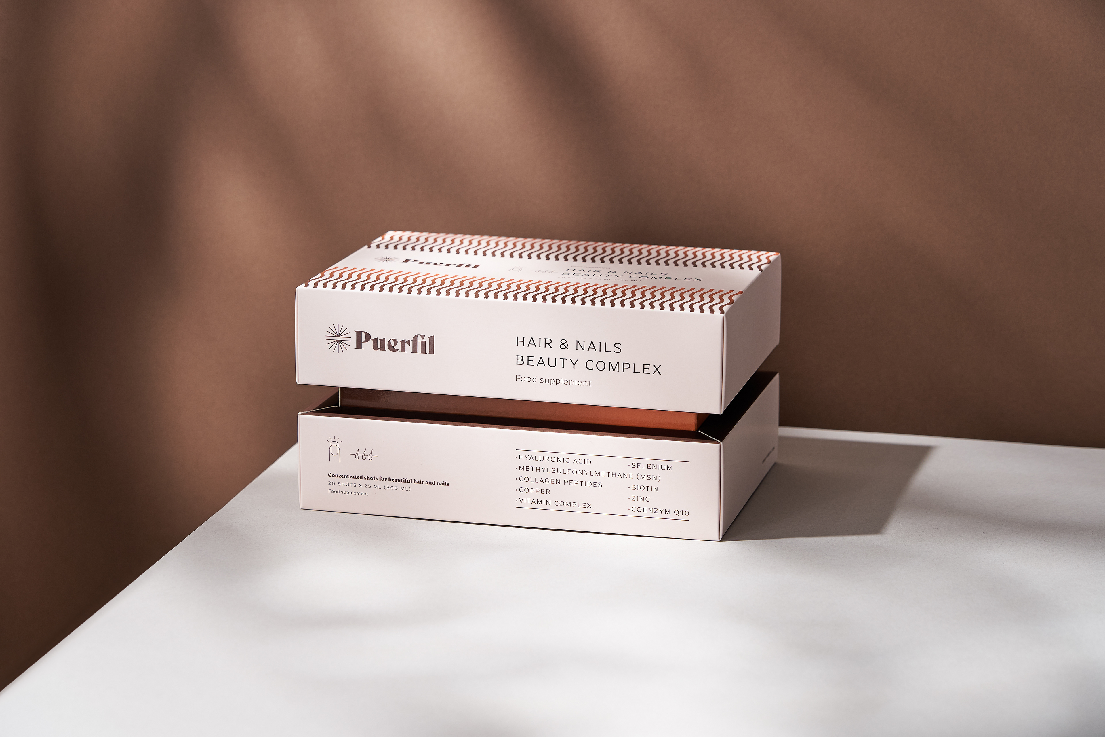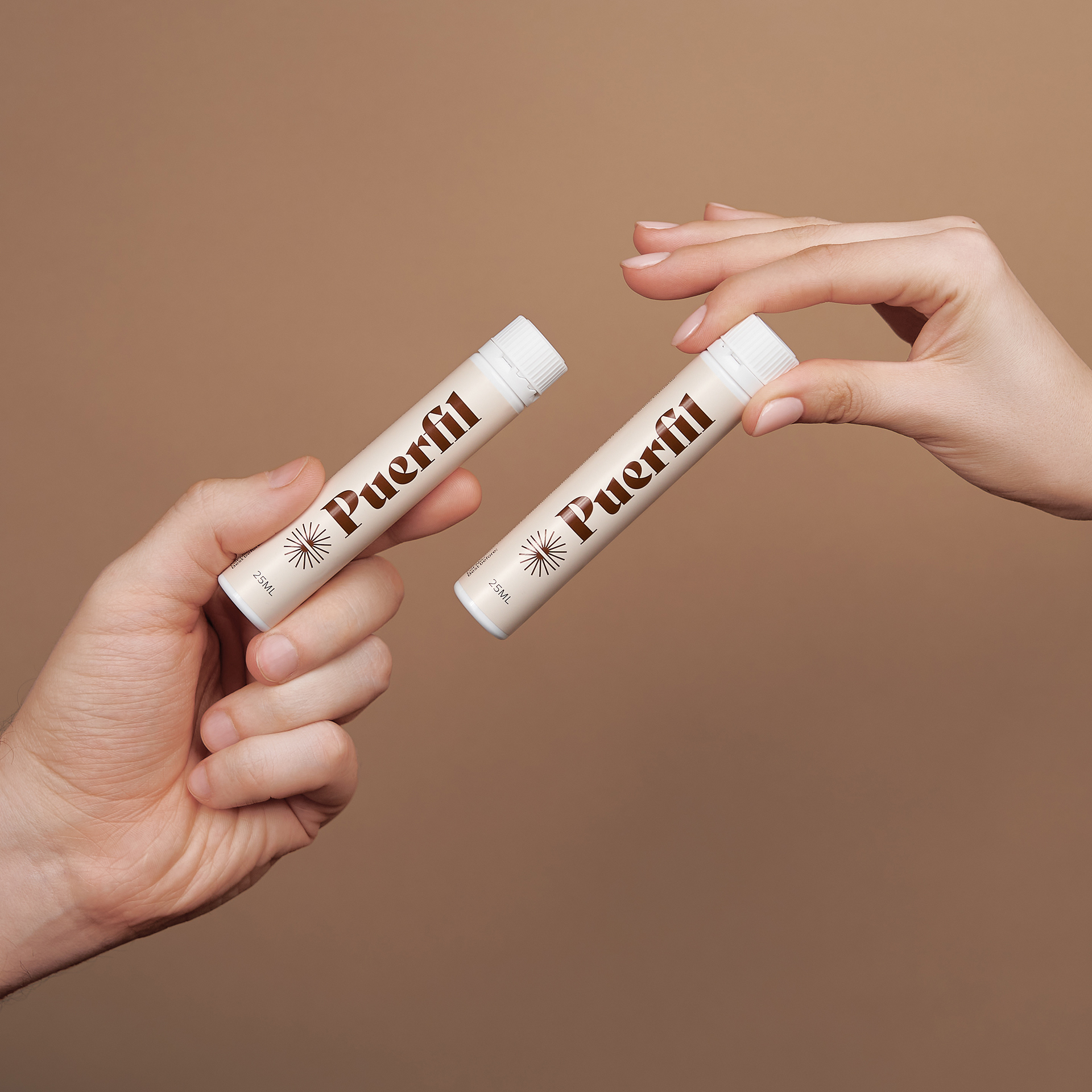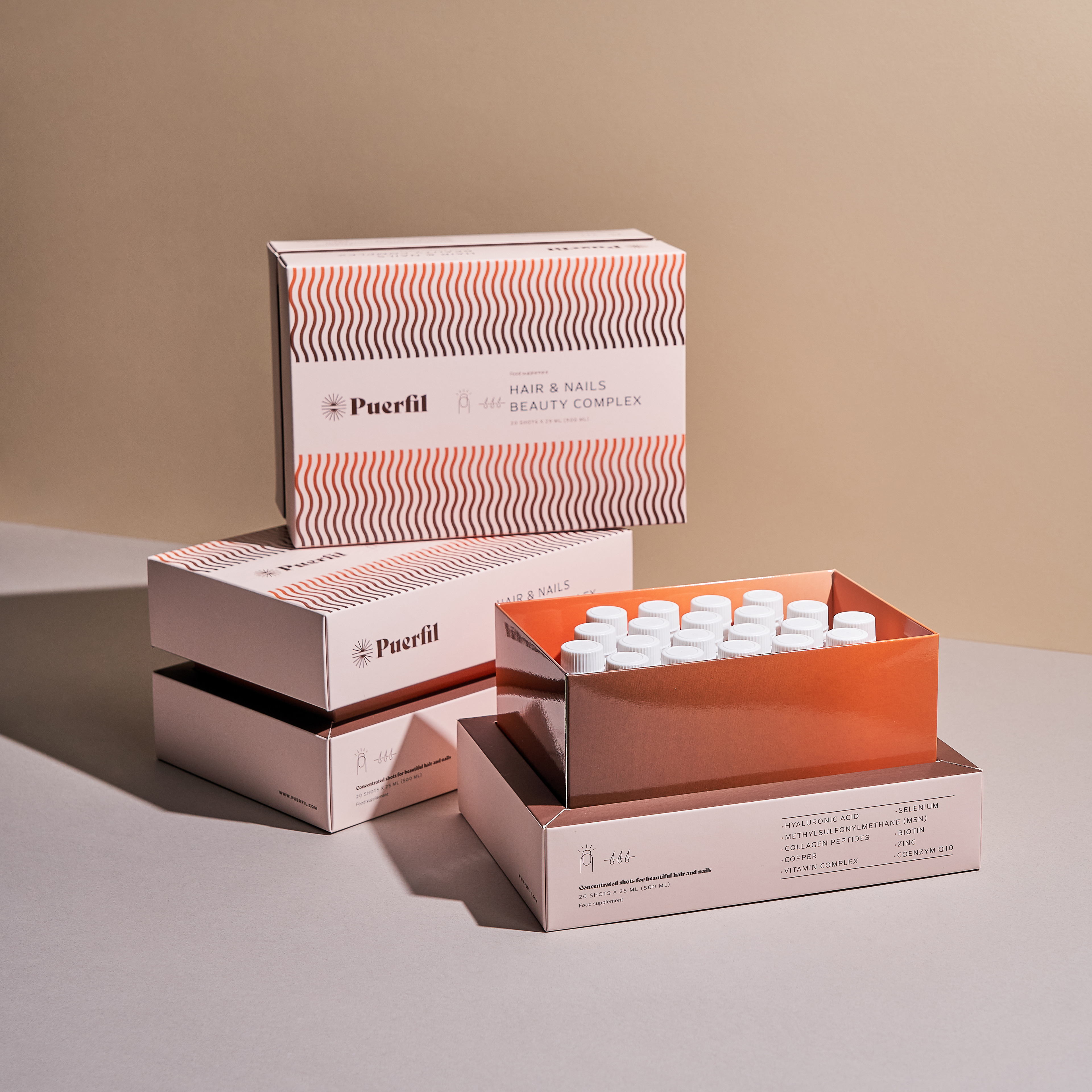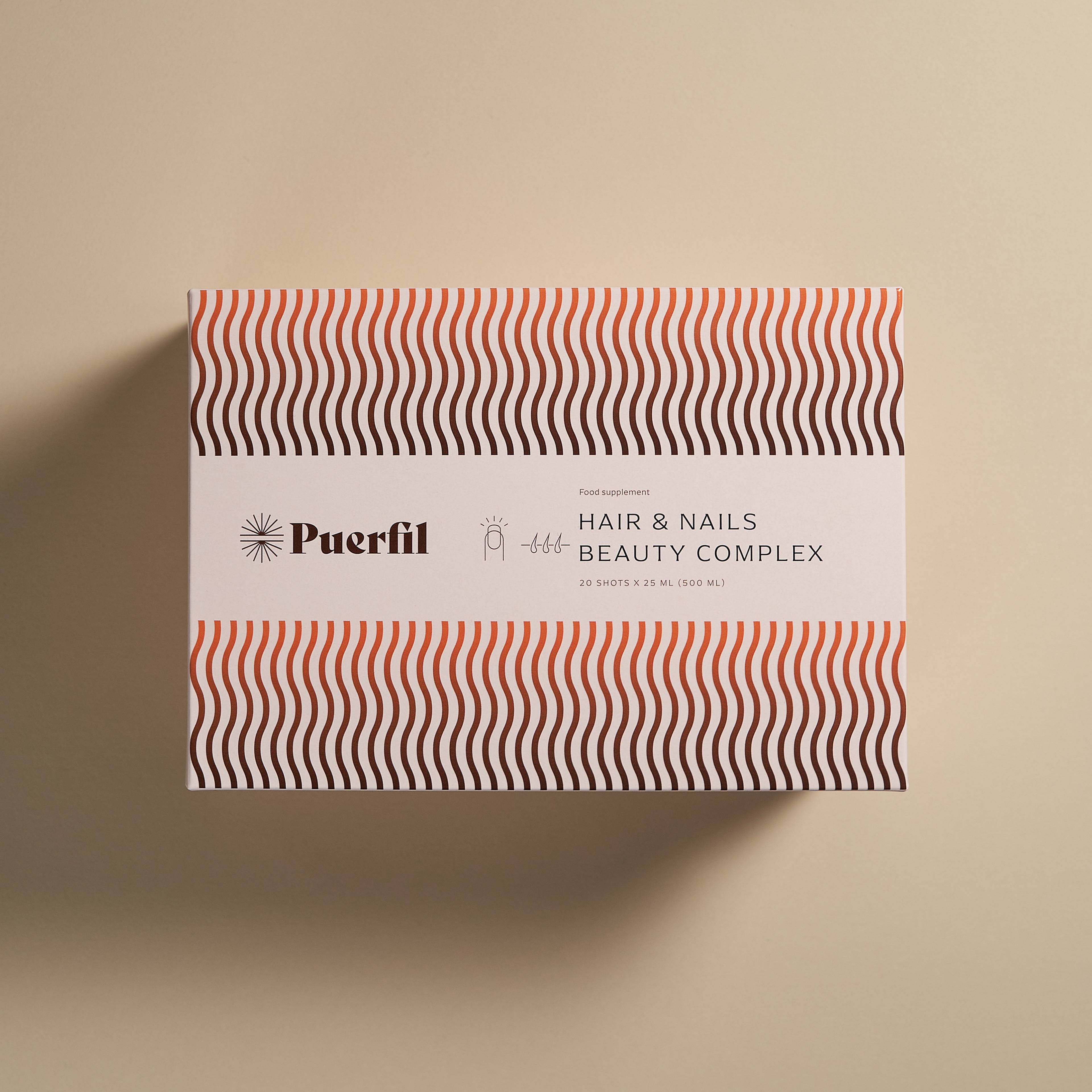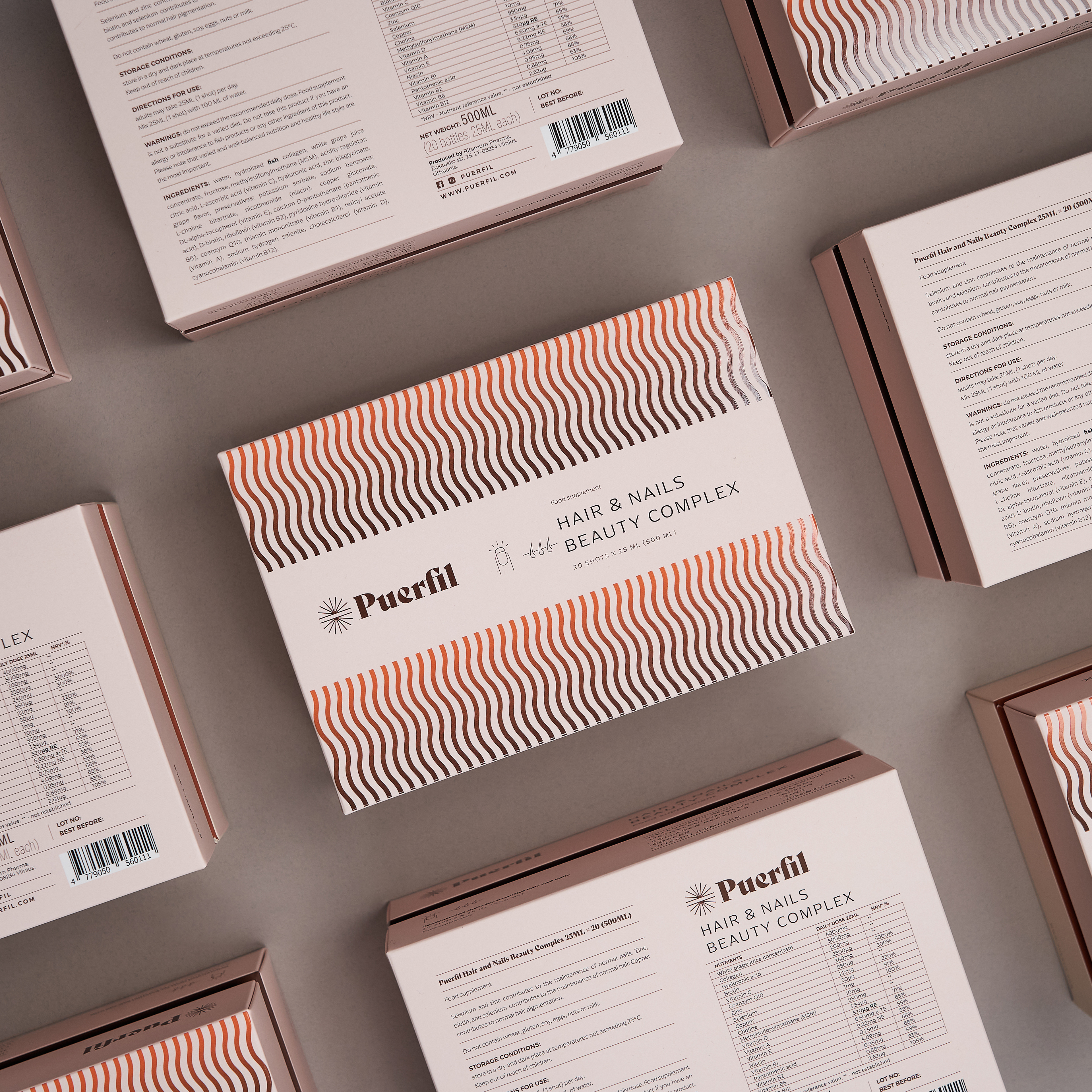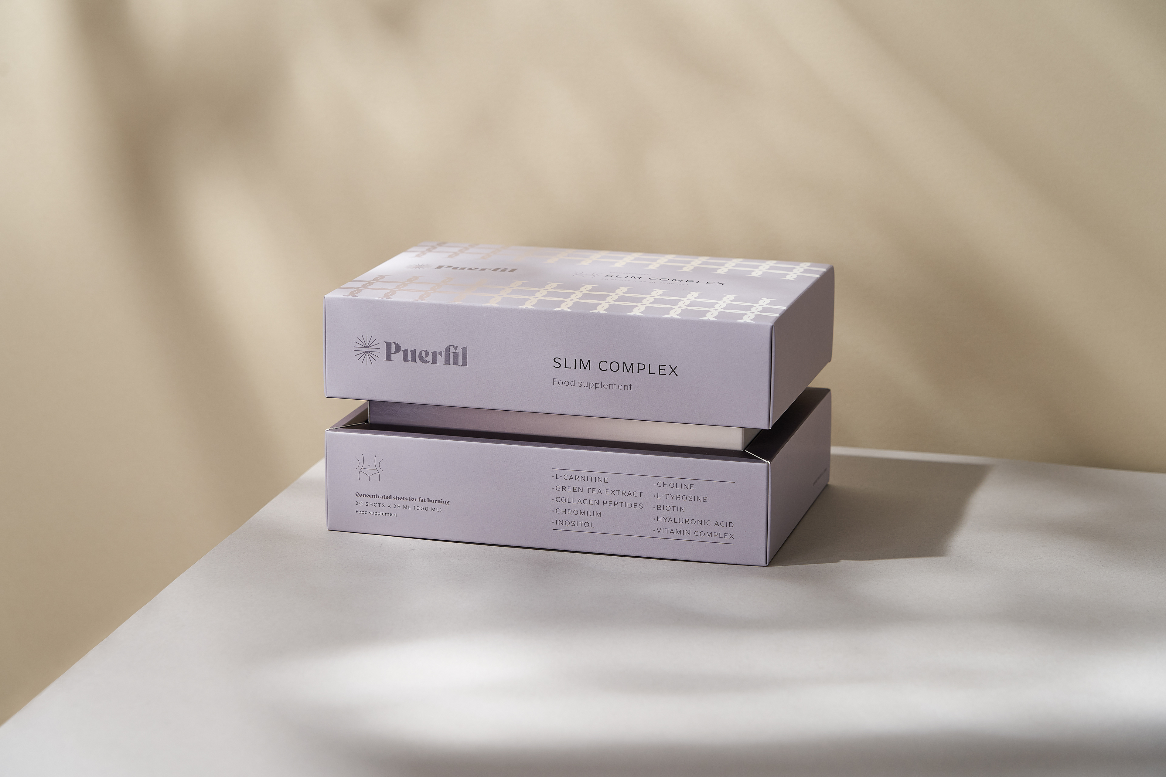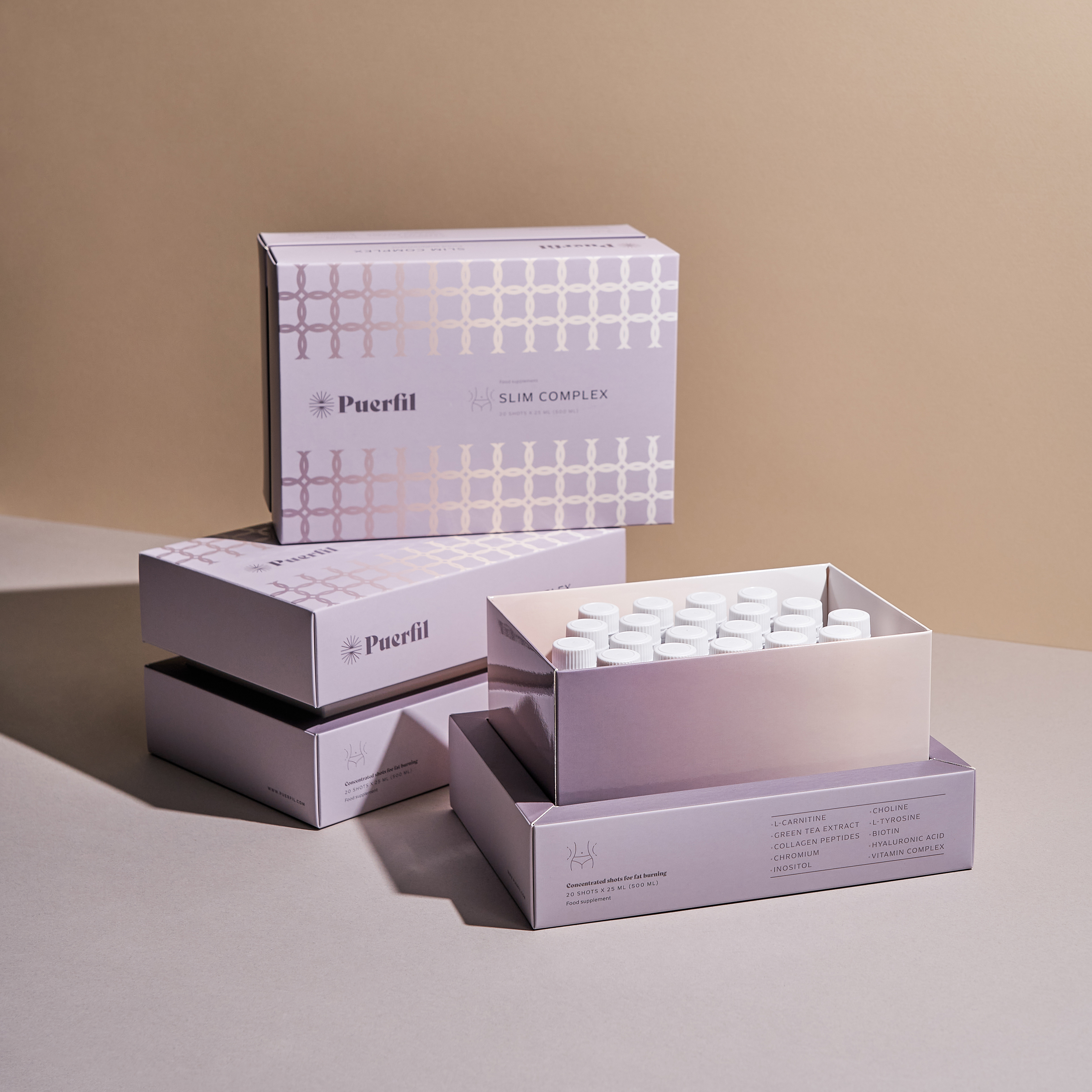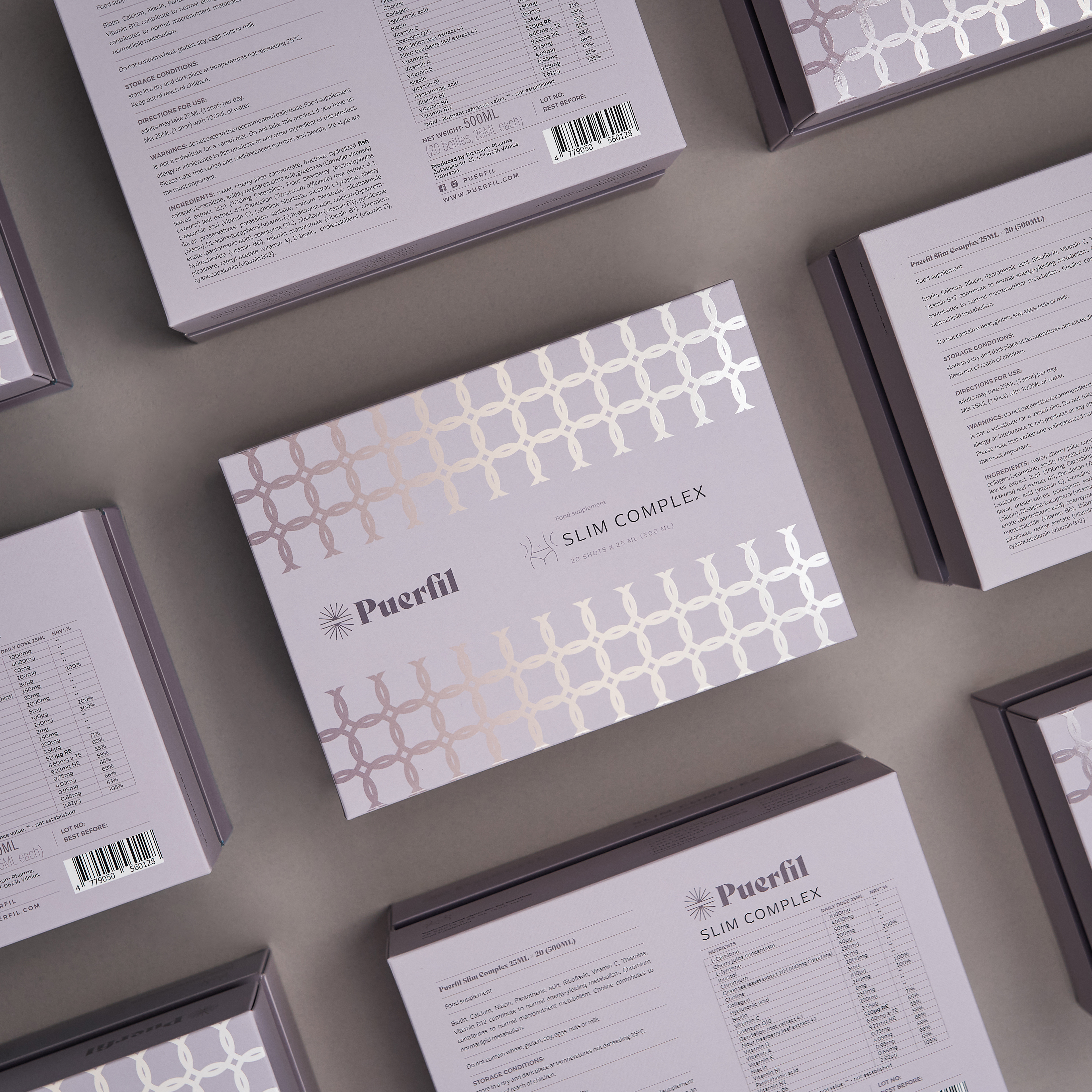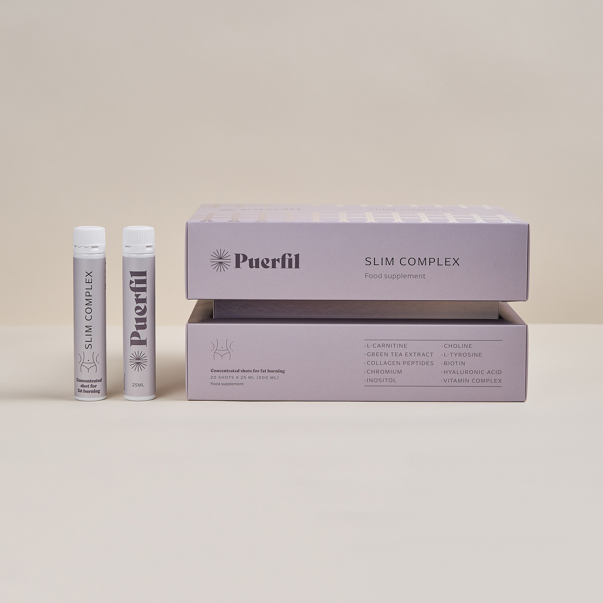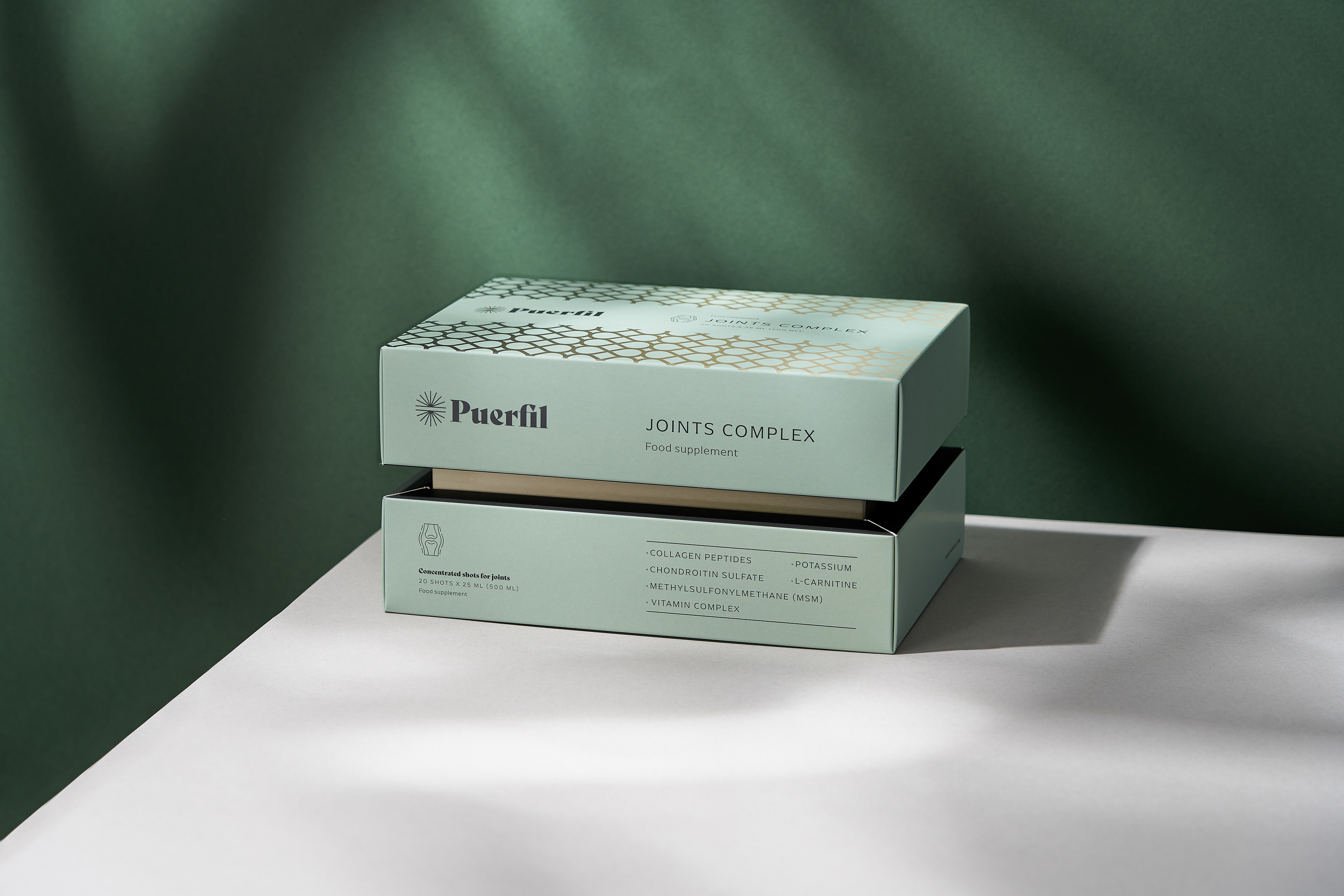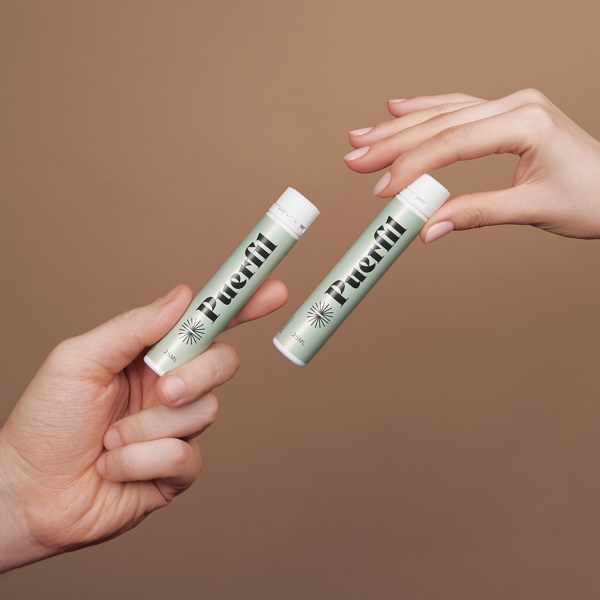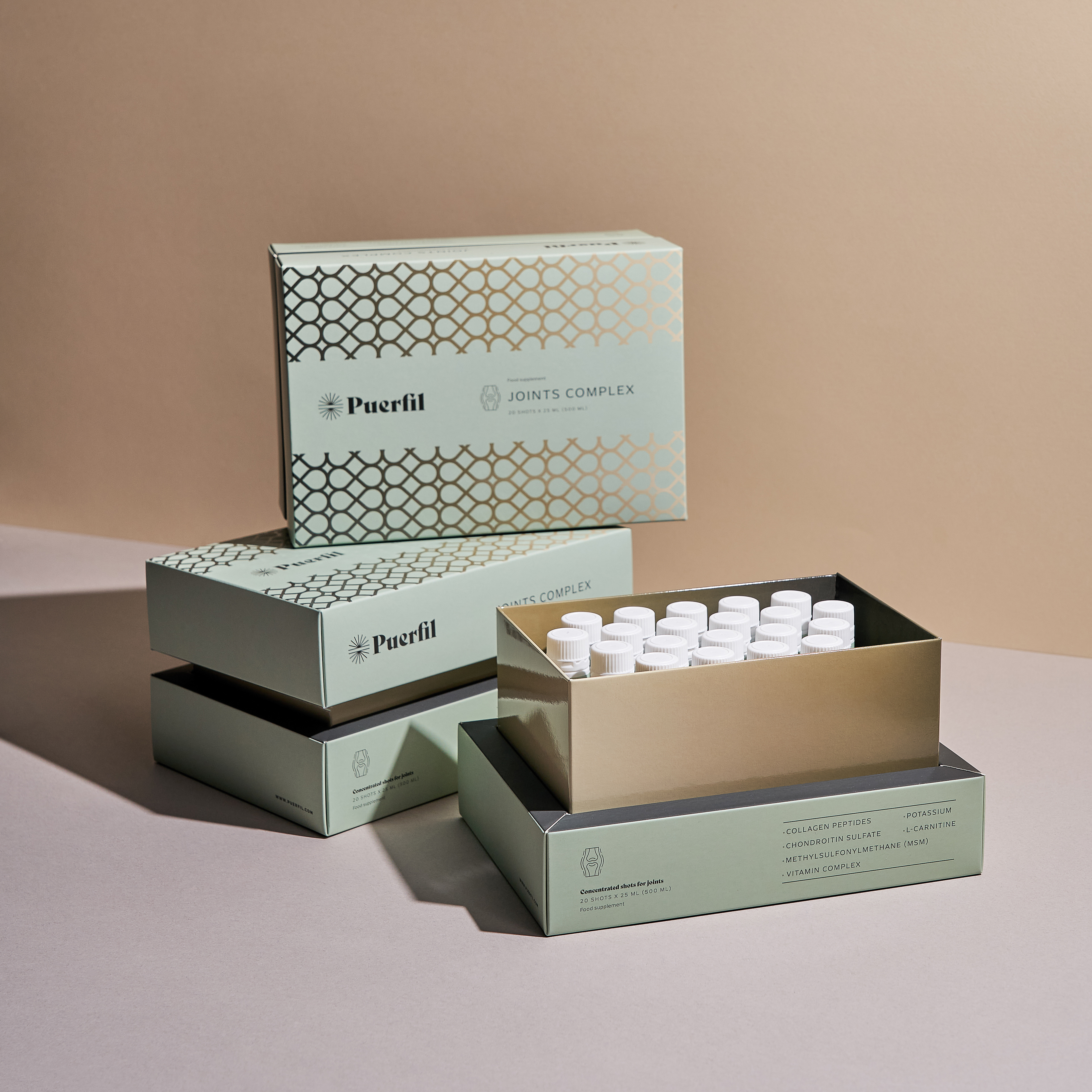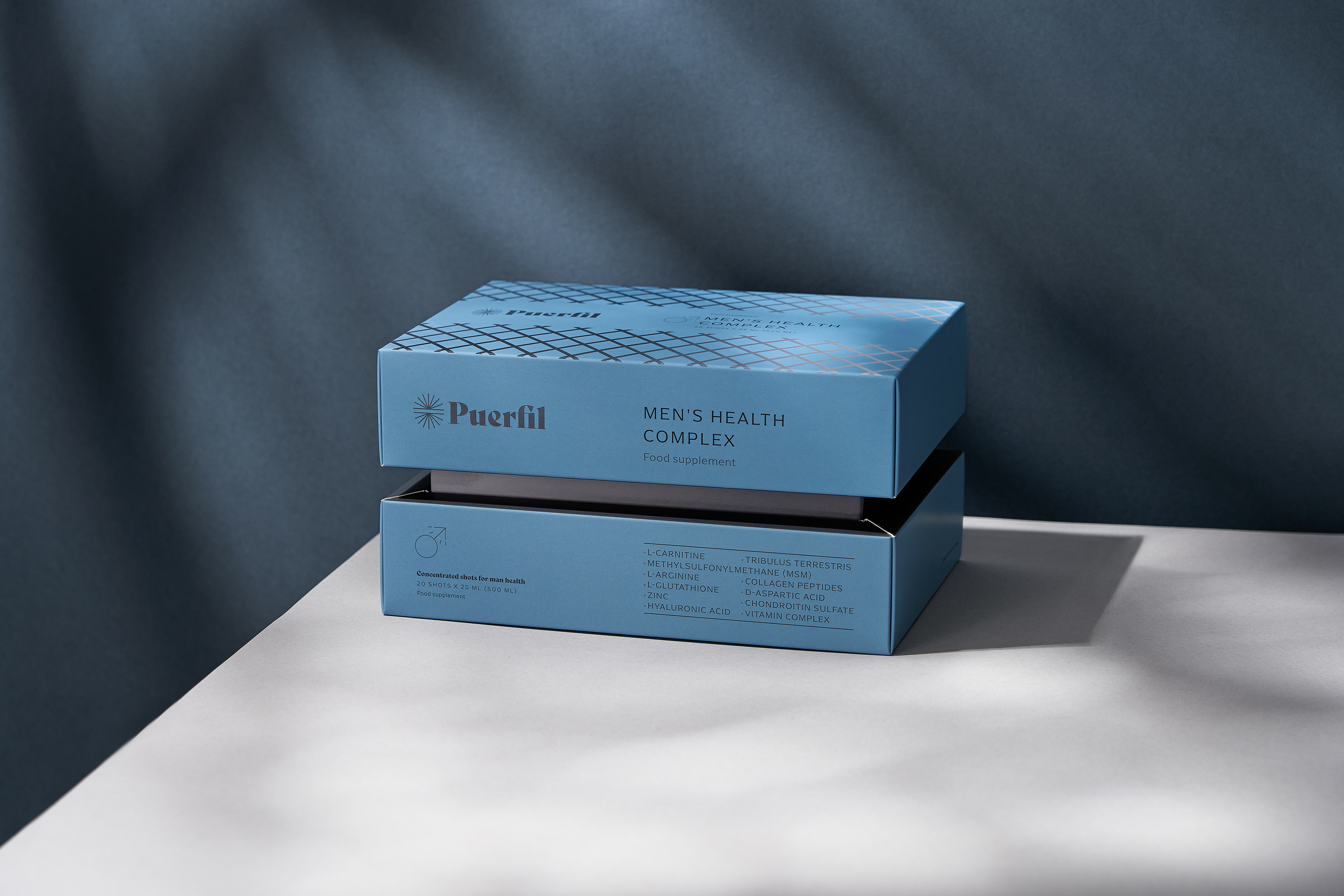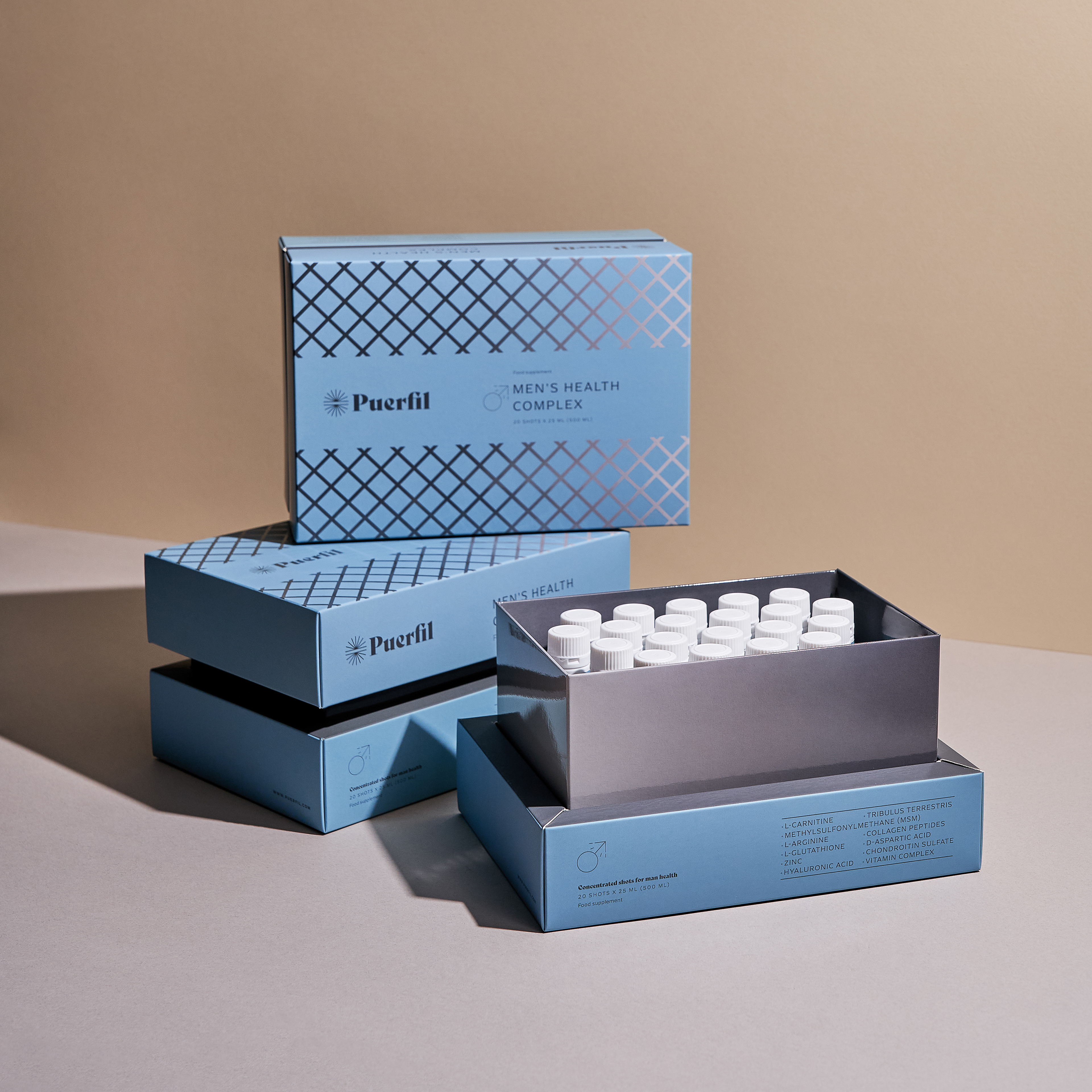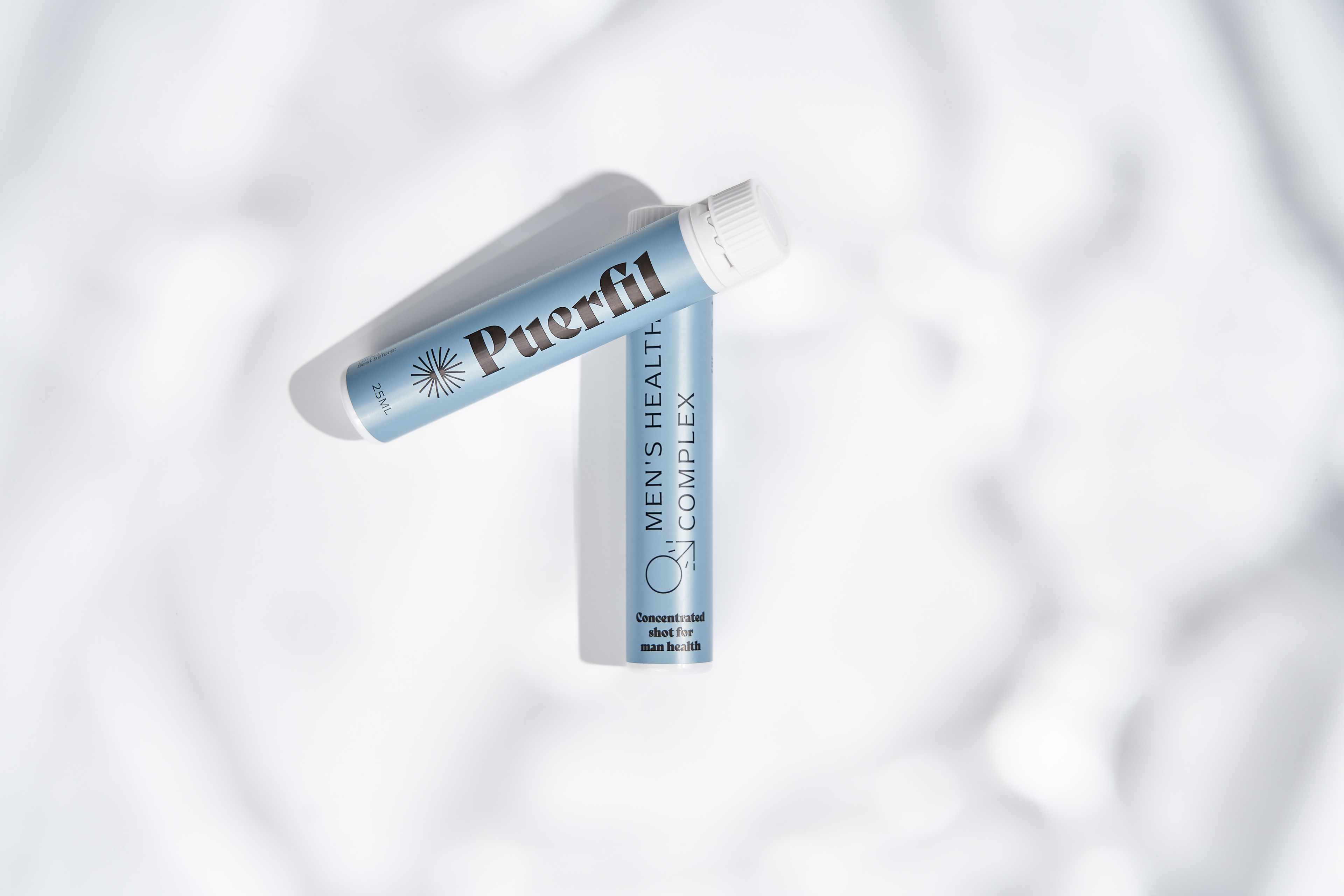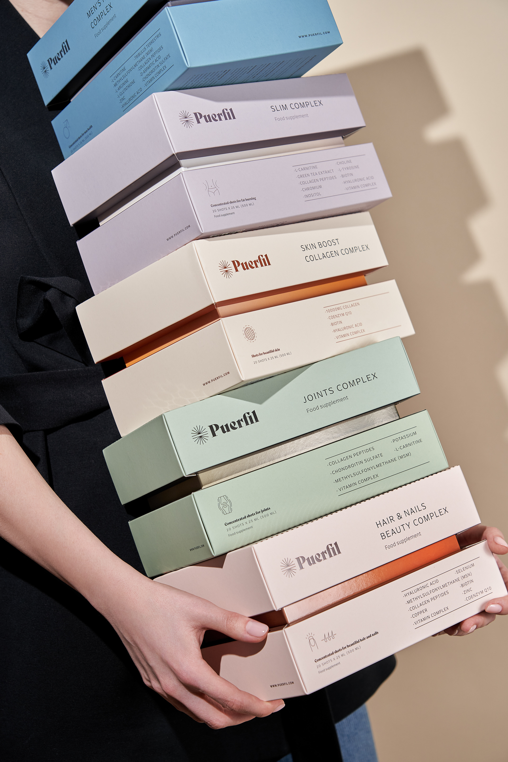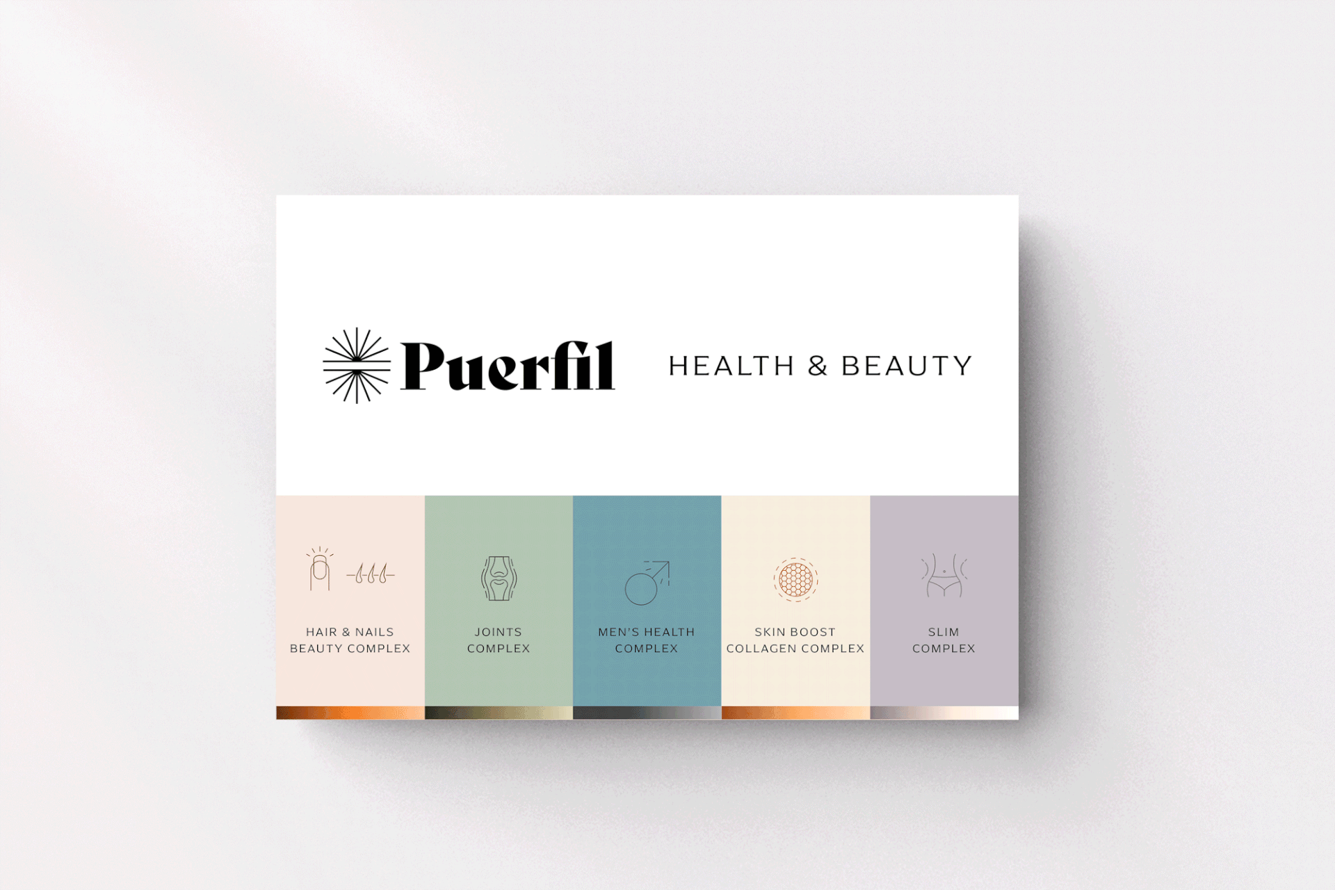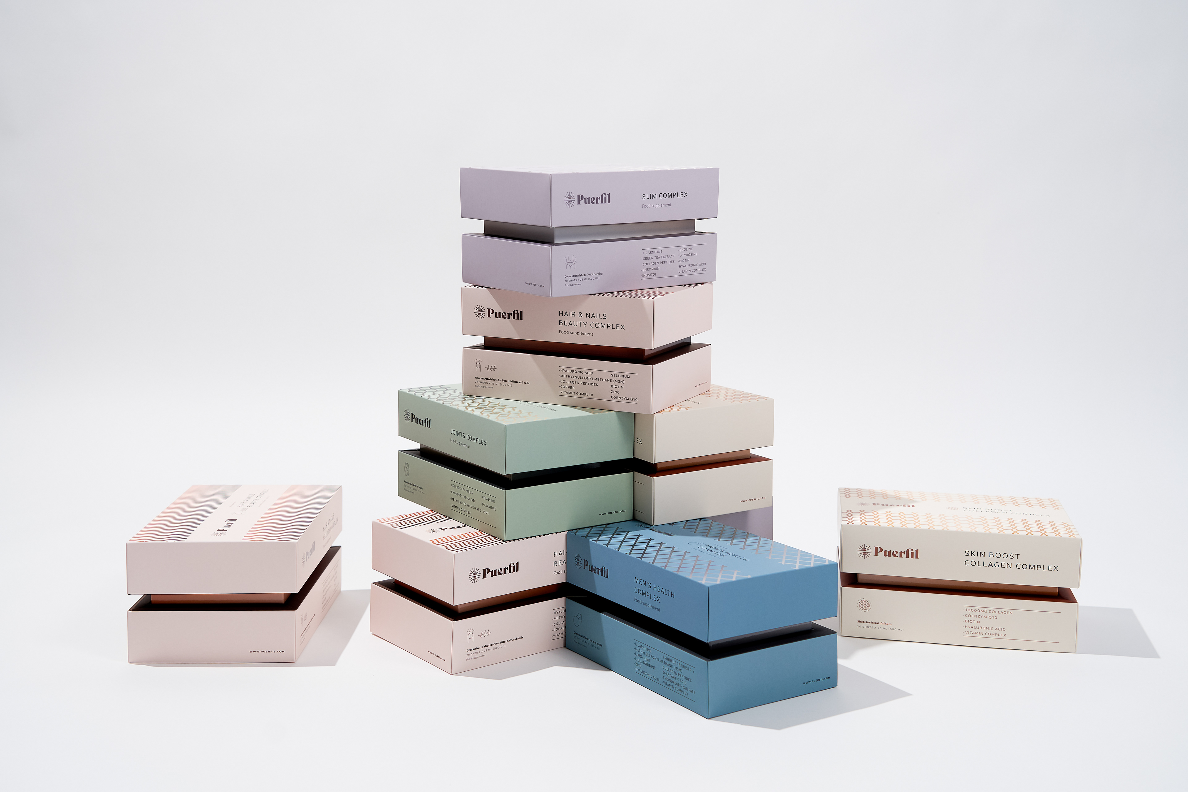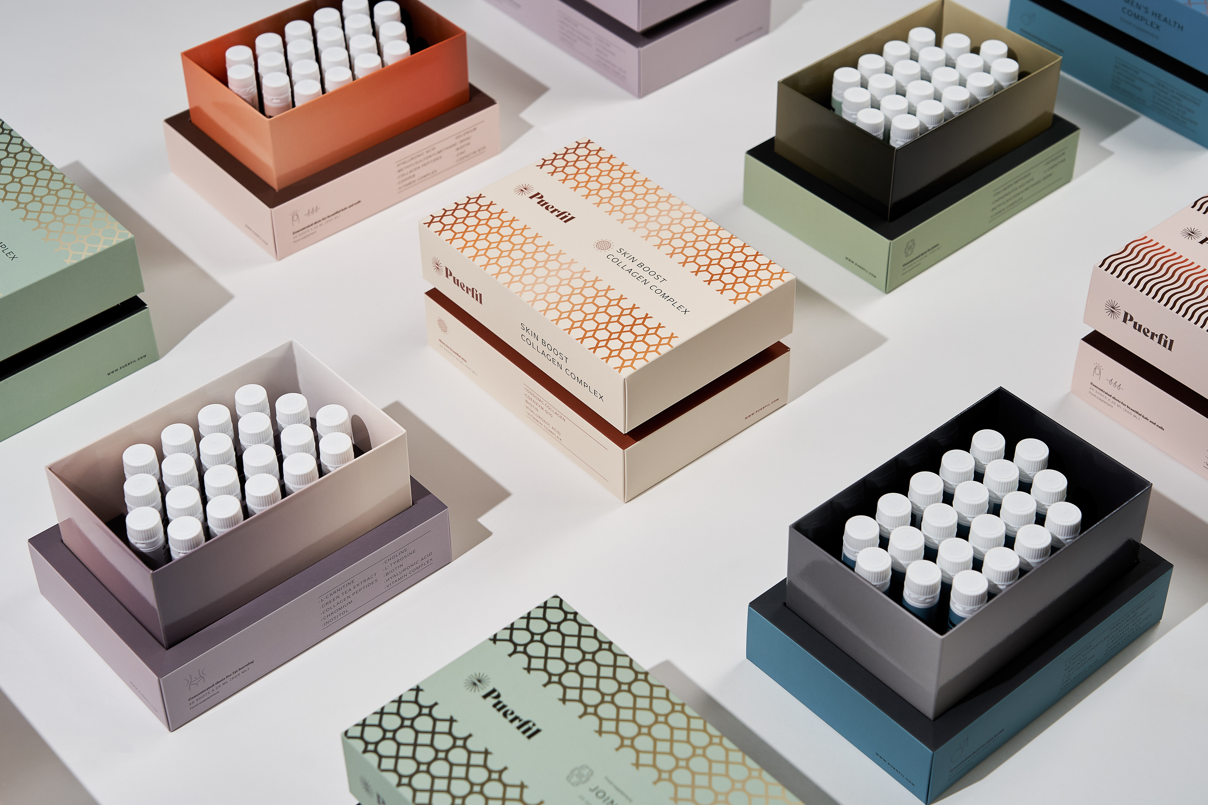
Puerfil is a liquid dietary supplement line which consists of five effective products: for joints, skin, hair & nails, men health, weight control. Easy and convenient dosing liquid supplement designed to completely improve your well-being and daily diet with the necessary vitamins and minerals.
OBJECTIVE
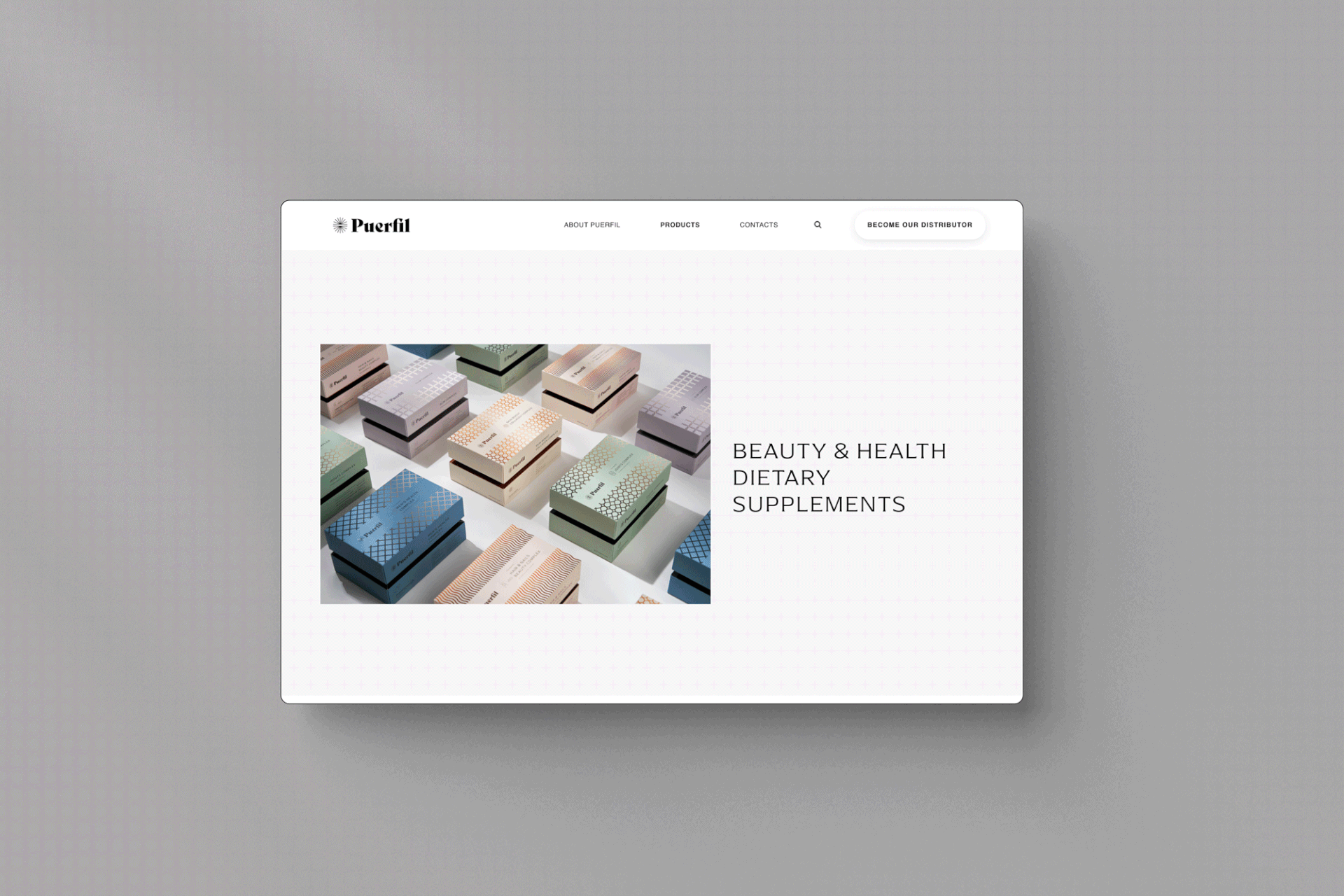
Represent the uniqueness of the product through brand design, photos, website and packaging creating a coherent experience. The brand should be relevant in daily supplement routines and becoming a great option for taking supplements when traveling or on the go.
SOLUTION
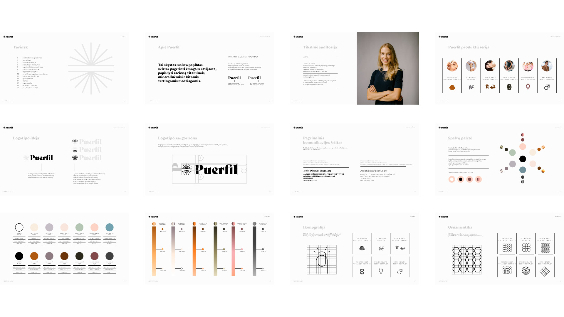
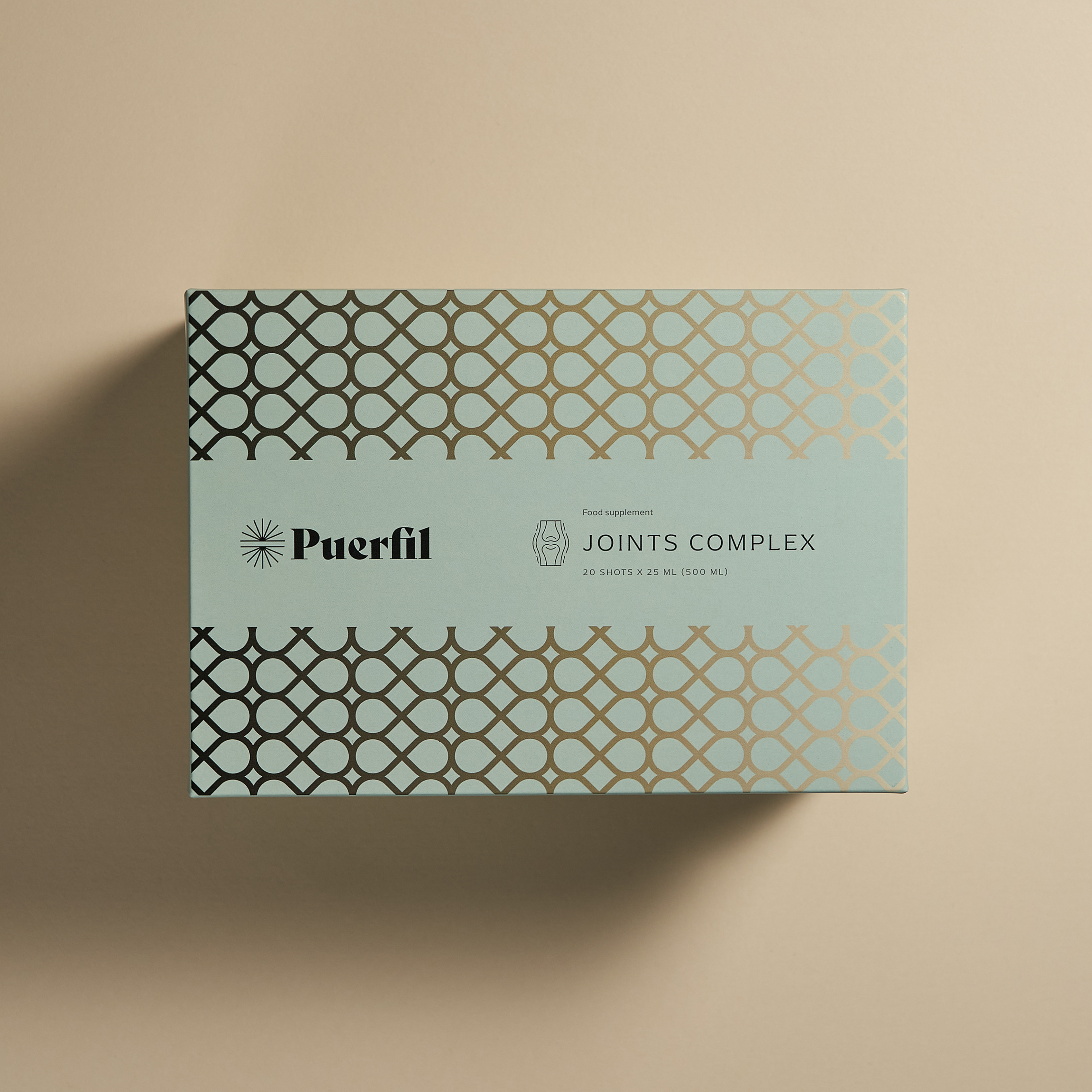
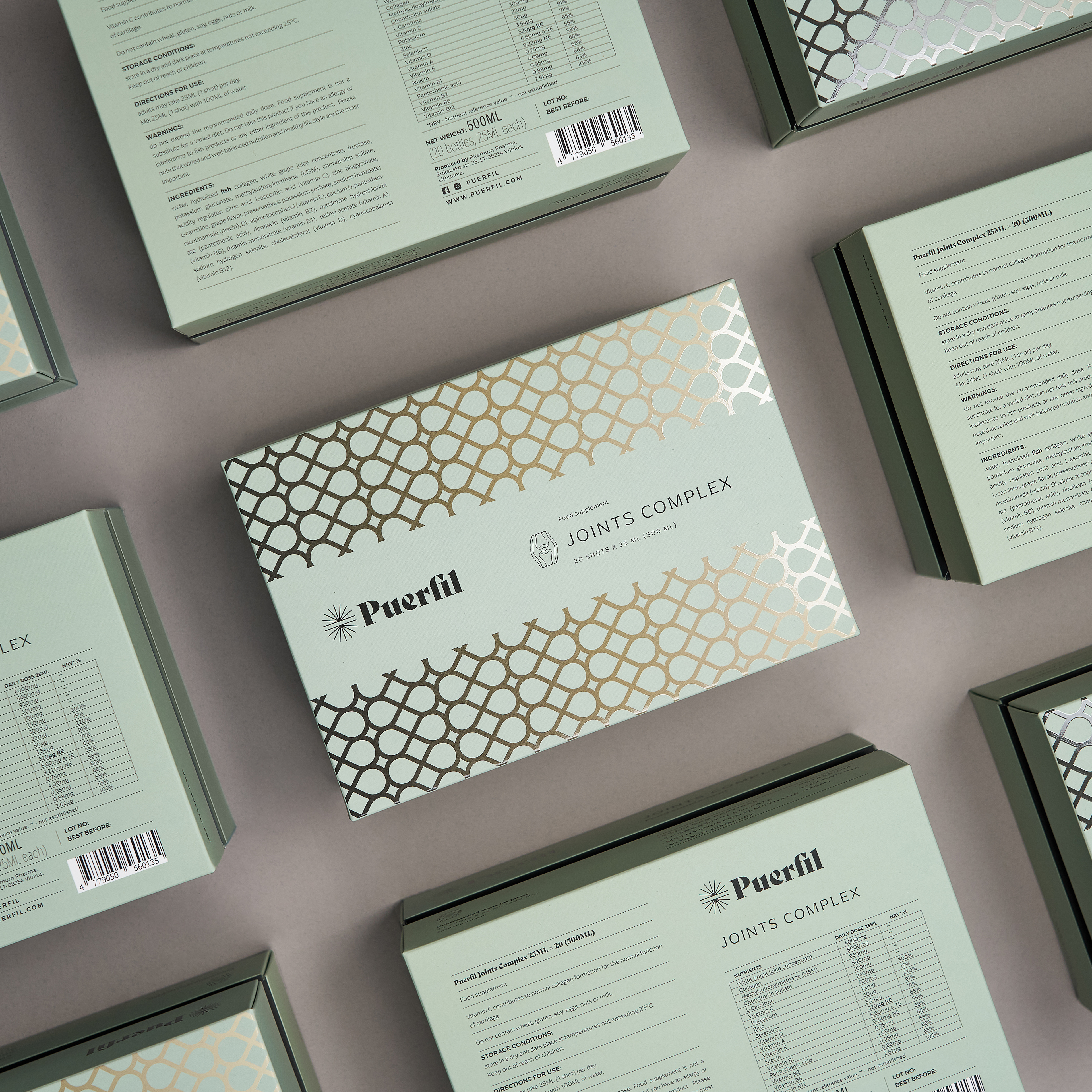
For the logo, I have designed a lockup that integrates the elegant, modern, and fun brand essence. I have been inspired by the honeycomb, the most iconic shape that bees use to store honey and pollen. The goal for the visual identity was to create a universally understandable symbol and color palette system that conveys the flavor of the honey through color and icons.
I have also designed icons complementing the different Lithuanian berries and spices that are used to infuse honey with flavor as well as dish suggestions honey goes well with. For the color palette, I have chosen colors of berries and spices, conveying the taste and complimenting the color of the honey it is infused with.
DELIVERABLES
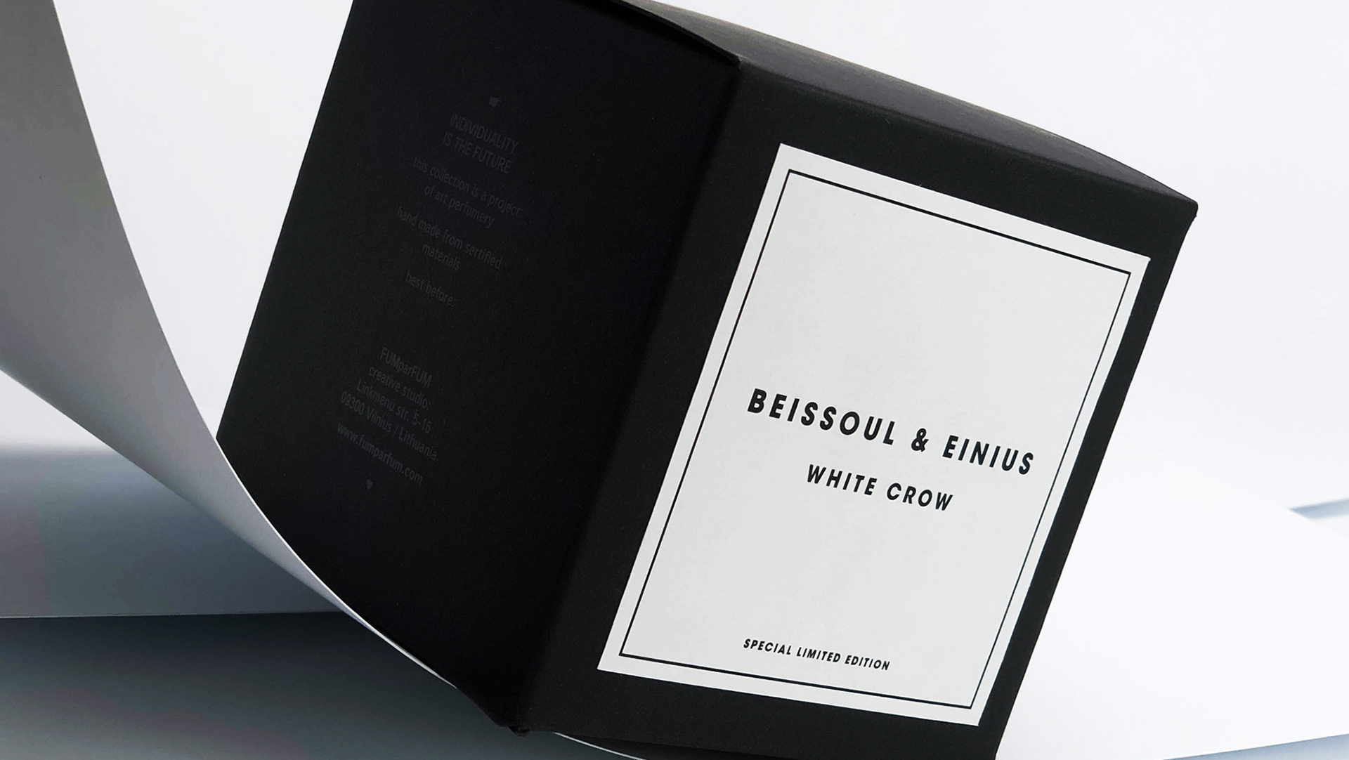
Art direction, Logotype design, Naming, Brand identity, Packaging, Web design, Presentation design
PHOTOGRAPHY: LUMA FOTOSTUDIJA